Over the past few months of posting updates and questions on social media, one thing has come up more and more often.
You really have to do something about that space in your verb menu!
Despite being a designer, the gap in the verb interface didn’t bother me, and it really surprised me that the aesthetic of my UI was so important to others. It really seemed to put them off the idea of playing the game as they would be too busy vomiting whenever they saw my brazen disregard for symmetry in their peripheral vision.
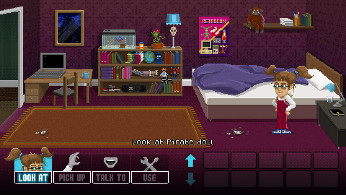
My verb/command interface has been slightly contentious from the start, and I have written about it in slightly more depth here. I toyed with which verbs to include/exclude and ended up with the five shown above. Unfortunately five is a prime number, and somewhat tricky to lay out nicely in a grid on one side of the screen (unless you’re using a verb wheel/coin).
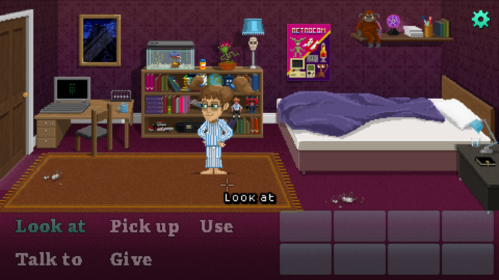
I had been a bit unhappy with the over-simplified text buttons in and was looking at tarting them up anyway when the suggestion above popped up yet again on Facebook.
To put this issue to bed once and for all, I posted the potential solution below on social media – essentially adding a new, inert verb which fills the space but doesn’t require any additional development or responses to implement.
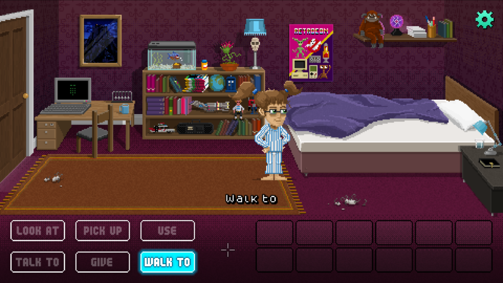
I oped for “Walk to” which is what Visionaire suggest as the default command in their tutorials. It looks useful, feels natural, but doesn’t really add anything to the gameplay (and therefore the dev) unless you genuinely enjoy just watching a sprite move around and achieve nothing.
But this solution has another problem.
I have plans to add a new contextual verb for specific scenes/puzzles in the game where Lucy may be required to perform a unique/unusual action (e.g. within a dream scene she may acquire a new ability which is not applicable in other dreams, or within the real world).
Adding the “Walk to” command had now scuppered that slightly, although I have to admit that the symmetry is pleasing, and a lot of others agreed that it was worth it even if the command itself wasn’t adding any inherent value.
In my conversations with other developers, a number of other potential solutions presented themselves, and then @lancelot_game offered a surprisingly elegant solution.
Why not just remove “Give” and fallback to “Use” e.g. “Use Plump guinea pig with Hungry jackal.”.
I had actually debated this with others in the past saying that there was an important distinction between something like “Give cannon to defenseless child.” and “Use cannon with defenseless child.” but I decided that I could heavily imply whatever meaning was most appropriate in the game and then there would be no surprises when the responding character either took the object graciously or was blown to smithereens.
I went through all of the “Give” interactions in my game, and apart from a few supercilious responses which no-one was ever going to discover, I had pretty much replicated the “Give” command whenever a player tried “Use” on each character anyway.
I bit the bullet and removed it, and the world didn’t implode.
I now had oodles of space to play with, and decided to move even further away from the LucasArts/Terrible Toybox verb grid that I’d originally intended to replicate, in favour of a simpler, more visual, animated interface.

I am happier with the result, and feel like it represents the tone of the game much more. I am going to keep them this size for the demo, but may reduce their width slightly (or the width of the inventory) to accommodate the additional verb in the full game.
Let me know what you think!